Tuesday, 22 May 2012
Pentagram Magazine
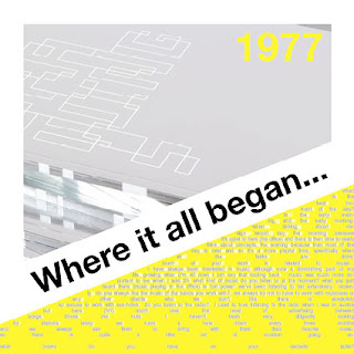
The objective of this project was to pick a particular artist and create a magazine design around aspects that represent that artist as well as meet the Pentagram expectations. I worked out a colour scheme that I thought worked best throughout the magazine, I also considered a theme of how all my work was to be placed into the design template and I came to a conclusion that it looked good when everything was cut to a diagonal, really like how the design has worked out very continuous and can be easily recognised as a set or the main focus a part of a magazine. I also considered different types of typography and how they work together to build up a collage based image.
Subscribe to:
Post Comments (Atom)


No comments:
Post a Comment