Tuesday, 22 May 2012
Tavistock Retro
I created this design by starting off with a simple cream background with a wood texture overlay as it is complimentry to the style of my design. I then went on to using Illustrator to trace the existing logo that I was using, using the pen and smooth tool to make it perfect. Next I inserted my imagery that I created simply using the shape tool and filling it with my choice of complimentry colours I chose to represent the Italian theme. I then simply just started playing with plain very legibal type faces to include the relivant information and this is where I also played around with layout and sizes to allow all all my information to breath and sit nicely within the design. Again I took advantage of the colour choice and changed my heading using the colours of the Italian flag to make them stand out and give off positive attention. I kept my attention focused on keeping all my promotion material continuous based on colours and the things that are included. Overall I am really happy with the outcome as it reprisents exactly what I have shown in my development and hits all of my targets that I have aimed for within my proposal.
NHS Logo
This is a logo created for the NHS, for the Newcastle Medical Photography Department. I simply used a basic light typography based around legibility. I then focused on enhancing the first letter of each word hoping eventually the logo could be recognised on its own just as NMP. I used a basic colour scheme and stuck to light pastel colours that look fresh and clean just like a hospital. Overall it shows a very effective but simplistic approach.
Pentagram Magazine
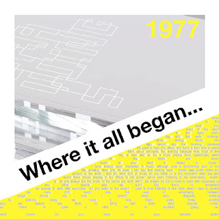
The objective of this project was to pick a particular artist and create a magazine design around aspects that represent that artist as well as meet the Pentagram expectations. I worked out a colour scheme that I thought worked best throughout the magazine, I also considered a theme of how all my work was to be placed into the design template and I came to a conclusion that it looked good when everything was cut to a diagonal, really like how the design has worked out very continuous and can be easily recognised as a set or the main focus a part of a magazine. I also considered different types of typography and how they work together to build up a collage based image.
Book Cover Develoment
As a part of my development I chose to use the facilities of the photography studio. experimenting with different lights and poses etc to get the perfect image for my final piece. To do so I used various props including a fancy dress costume of little red riding hood which was one of the Brothers Grimm stories making the relation really good , I also used a apple which related to another story which is Snow White I really like how I was able to combine two stories together to show the variety of there work to make one. Finally I used paint and jam to relate to the 'Grimm' theme again to give the idea of blood to my final piece.
Brothers Grimm book cover
I produced this design for my second project based around the Brothers Grimm fairy tales as well as the very well known penguin books. To create this I collected first hand photography of my self , which I then digitally enhanced using Photoshop. I changed various parts of the image using many effects for example I used the burn tool to enhance the light and dark parts of the images as well as adding a grungy texture over the top to make it relate more to the 'Grimm' theme. I also love how the book looks when put in situation like the underneath image, it really gives a feel of how it would look if my design was to be used.
Subscribe to:
Comments (Atom)


